Dialogue Script Cards
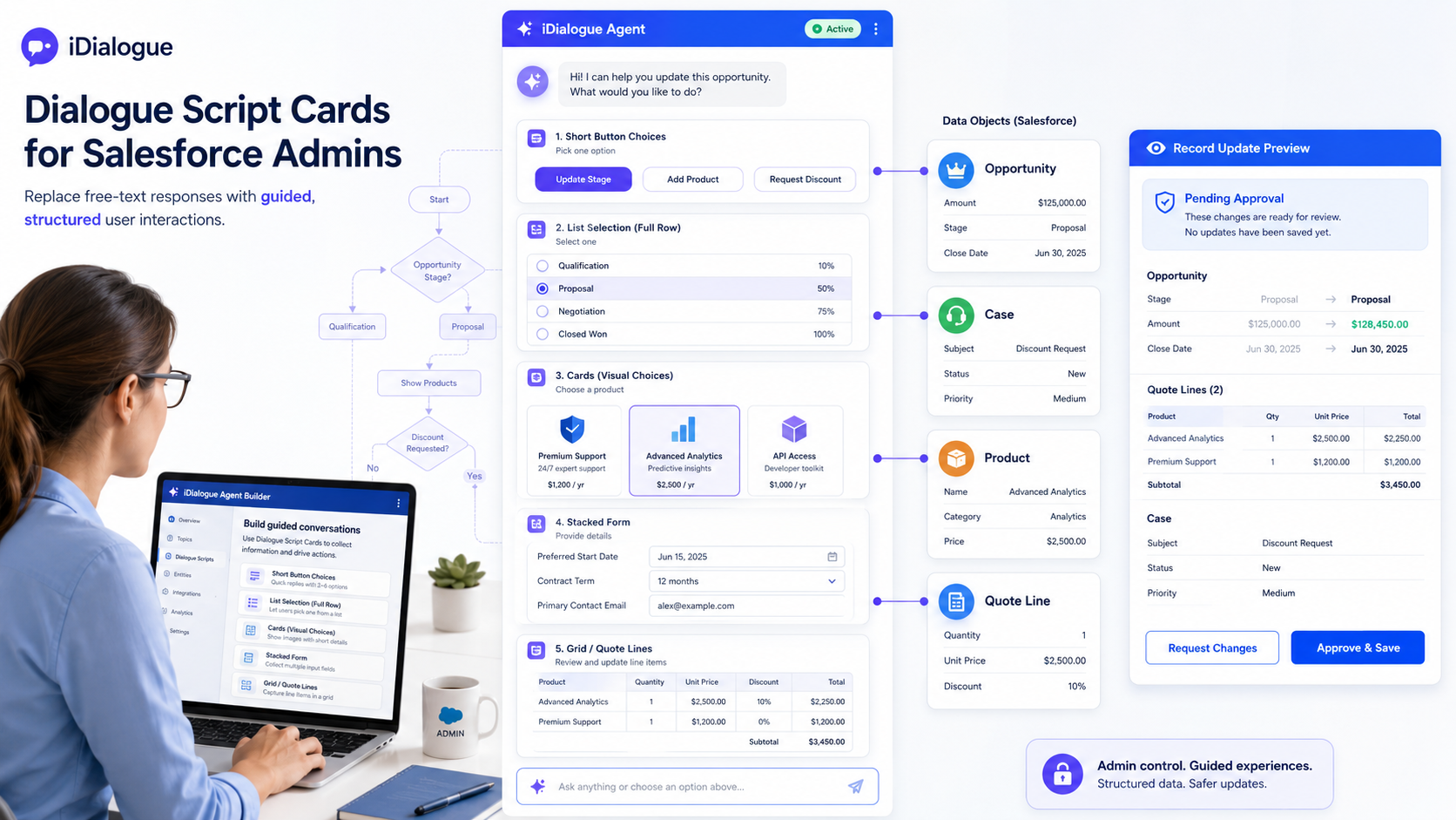
Dialogue Script Cards are guided response controls that an iDialogue Agent can show inside the chat. Instead of asking a user to type an answer, the agent can present buttons, list rows, product cards, checkboxes, forms, or review grids.
For Salesforce Admins, the important idea is simple: write clear Agent instructions that tell the agent when to use a guided card and what kind of card to show. The underlying tools are ask_user_choice for choice cards and ask_user_form for forms, but most Admins only need to describe the desired experience in the Agent instructions.
Where to Add These Instructions
Paste the instruction blocks on this page into one of these Agent Builder locations:
- The Agent's main System Prompt, when the behavior should always apply.
- A related System Instruction, when you want a focused block such as "CPQ Guided Workflow" or "Case Resolution Cards".
- A test-only System Instruction, when you are experimenting before changing the production behavior.
Keep the instructions short, direct, and specific. Agents follow these blocks best when each block says when to use the card, which layout to use, and what the user should do next.
## Guided Card Basics

Use Dialogue Script Cards when the user should pick from known options or review structured values.

Use `ask_user_choice` when the user needs to choose one or more options.
Use `ask_user_form` when the user needs to review or edit fields, rows, quantities, prices, discounts, notes, or approval details.

After showing a card, wait for the user's submission before continuing. Do not guess which option the user selected.
Choosing the Right Card Type
Use this quick guide when deciding how the Agent should present a step.
| User Experience | Best For | Tool and Layout |
|---|---|---|
| Buttons | Short single-choice steps such as industry, issue type, product family, yes/no, or approval | ask_user_choice, layout = buttons |
| Full-width buttons | Short choices that should have more room on the page | ask_user_choice, layout = buttons, displayWidth = full |
| Lists | Long labels, descriptions, product codes, or case resolution options | ask_user_choice, layout = list |
| Visual cards | Image-backed product, package, diagram, or side-by-side comparison choices | ask_user_choice, layout = cards |
| Multi-select | Accessories, symptoms, affected systems, add-ons, or several applicable next steps | ask_user_choice, type = multi_select |
| Stacked forms | Intake fields, approval notes, editable summary values, or small structured reviews | ask_user_form, layout = stacked |
| Grids | Quote lines, product rows, pricing reviews, order lines, or repeated row data | ask_user_form, layout = grid |
Two settings are easy to confuse:
layoutcontrols what the card looks like: buttons, list, cards, stacked form, or grid.displayWidth = fullonly gives the card more horizontal room. It does not mean the Agent should use visual cards.
Single-Choice Buttons
Use buttons for the most common guided steps. Buttons work well when each option is short and easy to scan.
This is usually the best default for single-choice questions. It creates an experience similar to Salesforce Lightning buttons, not large product cards.
## Single-Choice Button Policy

For short single-choice steps, use `ask_user_choice` with:
- `type = choice_group`
- `layout = buttons`

Use button choices for industry, issue type, solution approach, product family, yes/no decisions, and approval questions.

Do not use `layout = cards` for ordinary text-only choices.
Example user-facing steps:
- "Which industry are you configuring for?"
- "Which issue type best matches this Case?"
- "Should I prepare the quote-line review?"
- "Which product family should we narrow to?"
Full-Width Buttons
Sometimes buttons need more room, especially inside a wide Salesforce record page. Use full width when the choices should span the assistant response area, but still look like buttons.
## Full-Width Button Policy

When short choices need more horizontal room, use `ask_user_choice` with:
- `type = choice_group`
- `layout = buttons`
- `displayWidth = full`

Use `displayWidth = full` only to widen the card. Do not switch to `layout = cards` unless the options include images or need true side-by-side product comparison.
Good uses:
- Industry choices across a wide Opportunity page.
- Product family choices with short names.
- Approval choices such as "Approve", "Revise", or "Cancel".
List Choices
Use lists when the option labels are too long for buttons. A list gives each option a full row and works well for descriptions, troubleshooting steps, and product codes.
## List Choice Policy

Use `ask_user_choice` with:
- `type = choice_group`
- `layout = list`
- `displayWidth = full`

Use list choices when option labels include long names, ProductCodes, symptoms, descriptions, or resolution paths.

Keep each option label clear and readable. Use stable values that the Agent can recognize later.
Good uses:
- "SERVER-BASE-001 - Rack server for standard workloads"
- "Password reset issue - user can sign in but cannot update password"
- "Escalate to Level 2 - data loss or production outage"
Visual Product Cards
Use visual cards when seeing the option helps the user decide. Cards are best for image-backed choices or true comparisons. They are not the best default for plain text.
## Visual Card Policy

Use `ask_user_choice` with:
- `type = choice_group`
- `layout = cards`
- `displayWidth = full`

Use cards only when options include images, diagrams, product visuals, or meaningful side-by-side comparison.

For each image option, include a clear image URL and accessible alt text. Prefer `fit = contain` when the full product or diagram must be visible.
Good uses:
- Product images for server packages.
- Network topology diagrams.
- Support schematics.
- Visual plan comparisons.
Multi-Select Choices
Use multi-select choices when more than one answer can be true. This is useful for accessories, add-ons, symptoms, affected systems, or troubleshooting evidence.
## Multi-Select Policy

For optional add-ons, accessories, symptoms, or affected systems, use `ask_user_choice` with:
- `type = multi_select`
- `layout = buttons`

Use `minSelections` and `maxSelections` only when the business rule requires a minimum or maximum.

After the user submits the selection, summarize what they chose before moving to the next step.
Good uses:
- Choose accessories: rack rails, cables, support plan, installation service.
- Select symptoms: error message, slow performance, login failure, data missing.
- Pick affected systems: email, billing, portal, integration, reports.
Stacked Forms
Use stacked forms when the user needs to review or edit a small set of fields. This is better than asking the user to type a paragraph with several values.
## Stacked Form Policy

Use `ask_user_form` with:
- `type = form`
- `layout = stacked`

Use stacked forms for short reviews, intake details, approval notes, contact updates, or Case resolution summaries.

Use editable fields only for values the user is allowed to change. Use display or hidden fields for reference values that should not be edited.
Good uses:
- Case resolution summary and internal notes.
- Approval note, effective date, and owner.
- Customer contact details before creating a follow-up task.
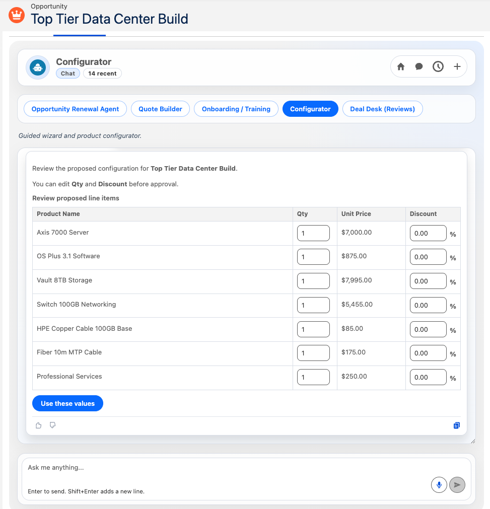
Pricing and Line-Item Grids
Use grids when each row represents a product, quote line, order line, or repeated item. Grids are especially useful for CPQ-style reviews.
## Grid Review Policy

Use `ask_user_form` with:
- `type = form`
- `layout = grid`
- `displayWidth = full`

Use grid forms for final quote-line, product, order, or pricing review.

In CPQ grids, show product identity as read-only values. Allow edits only to approved business fields such as Quantity, UnitPrice, Discount, Start Date, End Date, or Notes.

Do not create or update Salesforce records until the user submits the grid and clearly approves the final changes.
Good grid columns:
- Read-only: ProductCode, Product Name, Family, List Price.
- Editable: Quantity, UnitPrice, Discount, Notes.
- Hidden: Product2Id, PricebookEntryId, existing line item Id.
Example: CPQ Product Configuration
A CPQ guided workflow helps a seller or sales operations user narrow from broad choices to a final quote-line review.
Typical steps:
- Ask for industry or use case.
- Ask for product family.
- Ask for base product or ProductCode.
- Ask for optional accessories or add-ons.
- Show a final pricing grid.
- Wait for approval before creating or updating line items.
## CPQ Dialogue Script Cards

Guide the user through product configuration one step at a time.

Start with `ask_user_choice` using `layout = buttons` for industry and product family choices.

When ProductCode labels are short, use `layout = buttons`. When ProductCode labels include descriptions or pricing notes, use `layout = list` with `displayWidth = full`.

For optional accessories and add-ons, use `ask_user_choice` with `type = multi_select` and `layout = buttons`.

For image-backed products or packages, use `layout = cards` and include product image metadata.

After product selections are complete, use `ask_user_form` with `layout = grid` and `displayWidth = full` for the final pricing review.

In the final grid:
- ProductCode, Product Name, Family, and List Price are read-only.
- Quantity, UnitPrice, and Discount are editable.
- Product2Id and PricebookEntryId are hidden values.

After the form is submitted, summarize the proposed configuration and wait for clear user approval before creating or updating Salesforce records.
Example: Case Resolution
A Case resolution workflow helps support users move through a repeatable troubleshooting path without losing human control.
Typical steps:
- Ask for issue type.
- Ask for symptoms or affected systems.
- Recommend the next troubleshooting path.
- Collect resolution notes.
- Ask for approval before updating the Case.
## Case Resolution Dialogue Script Cards

Guide the support user through Case resolution with short, controlled steps.

Use `ask_user_choice` with `layout = buttons` for issue type:
- Login or access
- Billing
- Integration
- Performance
- Data quality

Use `ask_user_choice` with `type = multi_select` and `layout = buttons` for symptoms or affected systems.

Use `layout = list` when each troubleshooting option needs a longer description.

Use `ask_user_form` with `layout = stacked` to collect the final resolution summary, customer-facing response, internal note, and follow-up task date.

Before updating Salesforce, summarize the proposed Case changes and ask the user for approval.
Advanced Branching With Mermaid
For complex guided workflows, Admins can describe the decision path with a simple Mermaid decision tree. This can act like prompt source code: the Agent reads the tree and follows the intended sequence.
Start simple. Use Mermaid only when the workflow has multiple branches that are hard to explain in paragraphs.
flowchart TD
    A[Start Case Review] --> B{Issue Type}
    B -->|Login| C[Ask for login symptoms]
    B -->|Billing| D[Ask for invoice or payment details]
    B -->|Integration| E[Ask which connected system is affected]
    C --> F[Recommend troubleshooting path]
    D --> F
    E --> F
    F --> G[Collect resolution summary form]
    G --> H{User approves Case update?}
    H -->|Yes| I[Update Case]
    H -->|No| J[Revise plan]
## Mermaid Branching Policy

Use the Mermaid decision tree as the intended guided workflow.

At each decision point, show the user a Dialogue Script Card instead of asking for free text.

Use button choices for short branch labels, list choices for longer branch descriptions, and forms when the user must review or edit structured values.

Do not skip ahead in the tree. Wait for the user's card submission before continuing to the next branch.
Practical Admin Tips
- Make one decision per card.
- Use buttons as the default for short choices.
- Use cards only when visual comparison is helpful.
- Use lists when text is too long for buttons.
- Use forms when the user must review or edit values.
- Use grids when rows matter, such as products or quote lines.
- Always ask for approval before making Salesforce record changes.
- Test the Agent with simple examples before adding complex branching.
Quick Starter Block
Paste this into a new Agent when you want a safe default for guided cards:
## Dialogue Script Cards Default Policy

Use Dialogue Script Cards to guide users through known choices and structured reviews.

For short single-choice questions, use `ask_user_choice` with `type = choice_group` and `layout = buttons`.

For choices with long labels or descriptions, use `ask_user_choice` with `layout = list` and `displayWidth = full`.

For image-backed product or diagram choices, use `ask_user_choice` with `layout = cards` and `displayWidth = full`.

For optional add-ons, symptoms, or affected systems, use `ask_user_choice` with `type = multi_select` and `layout = buttons`.

For small editable reviews, use `ask_user_form` with `layout = stacked`.

For product, quote-line, order-line, or pricing reviews, use `ask_user_form` with `layout = grid` and `displayWidth = full`.

After showing any card or form, wait for the user's submission before continuing. Do not create or update Salesforce records until the user clearly approves the proposed changes.